Para celebrar su décimo aniversario, los chicos de
Action Tales me han propuesto hacer una ilustración dedicada al nacimiento de "Los Vigilantes",
una serie ambientada en un mundo donde los villanos Marvel son los
héroes y los héroes Marvel son los villanos.
Los Vigilantes son los "vengadores" de ese mundo, por asi decirlo: Von Strucker, El Duende Verde, el Doctor Octopus, Elektra, el Conde Nefaria y la Abominación.
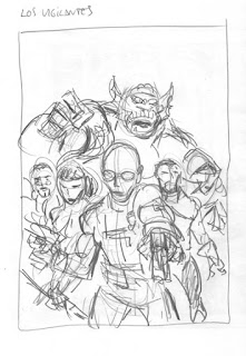
Empezamos con un boceto rápido a lápiz en tamaño 15x21 para plantear el diseño y composición de la ilustración.
(Haced click en las imágenes para agrandar)
To celebrate their 10th anniversary, the guys at Action Tales have proposed me to do an illustration dedicated to the birth of "Los Vigilantes", a series taking place in a world where the Marvel villains are the heroes and the Marvel heroes are the villains.
Los Vigilantes are so to say the "avengers" of this world: Von Strucker, The Green Goblin, Doctor Octopus, Elektra, Count Nefaria and the Abomination.
We start with a quick rough in pencil at size 15x21 cm. to establish the layout and composition of the illustration.
(Click on the images to enlarge)
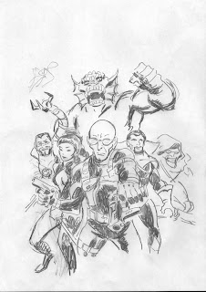
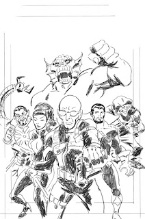
El siguiente paso es un boceto más detallado y a un tamaño mayor (A4).
Cuando realizamos una ilustración con varios personajes es normal que en un primer momento algunos personajes tengan menos detalles y queden menos definidos que otros, como ha pasado aquí por ejemplo con el personaje del Duende Verde.
Las piernas de Elektra tampoco tienen buen aspecto. Las corregiré en el siguiente boceto.
Next step is a more detailed sketch done at a bigger size (21x30 cm).
When doing an illustration with several characters it is usual to have some of them less detailed and that they remain less defined than the rest of the illustration. This has happened here e.g. with the Green Goblin.
Elektra's legs don't look good either. I'll fix them in the next sketch.
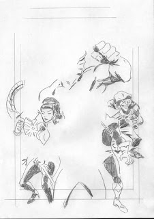
Hago un nuevo boceto con partes que necesitan más definición. Más tarde, en Photoshop pegaré estas zonas en el anterior boceto.
I make a new sketch with parts that need more definition. Later in Photoshop I'll paste these new zones on the previous sketch.
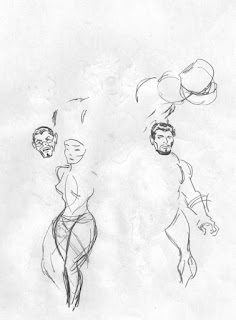
Este nuevo estudio es sólo para las cabezas del Doctor Octopus y del Conde Nefaria.
This new study is only for the heads of Doctor Octopus and Count Nefaria.
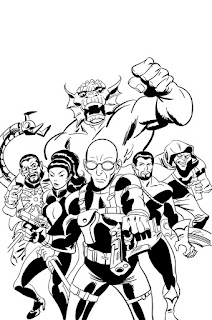
Todos los elementos anteriores combinados en Photoshop dan como resultado este boceto final que será el que utilizaré para el entintado ya que no necesito un dibujo detallado a lápiz.
He cambiado la posición del tentáculo de Octopus respecto del primer boceto ya que el diseño repetía el patrón del brazo de la Abominación. De este modo la composición y diseño parece más aleatorio y espontáneo.
All the previous elements combined in Photoshop give as a result this final sketch that will serve to do the inking as I don't need a detailed penciled drawing.
I have changed the position of Doctor Octopus tentacle from the first sketch because the design repeated the pattern of the Abomination's arm. This way the composition looks more random and spontaneous.
Ahora debo tomar la decisión sobre si entintar al modo tradicional o digitalmente.
Cada método tiene sus ventajas y sus inconvenientes. El entintado tradicional con plumilla y pincel es más rápido (al menos para mi) y permite más expresividad en el trazo. Pero el entintado digital es menos complicado técnicamente y permite corregir fácilmente.
Finalmente me decido por entintar digitalmente. Lo haré en Adobe Illustrator donde el fondo de la imagen puede ser transparente y eso hará más fácil si decido dar color en Photoshop a los trazos que ahora están en negro.
Now I must take a decision whether to ink the traditional way or digitally.
Each method has its benefits and disadvantages. Traditional inking with pen and brush is faster (at least for me) and allows more expressivity in the strokes. But digital inking is technically less complicated and allows to fix problems easily.
Finally I choose digital inking in Adobe Illustrator where the background of the image may stay transparent and that will help if I decide to color in Photoshop the black strokes.
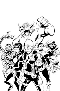
A continuación abrimos la ilustración en Photoshop. Apenas algunos retoques rellenando espacios de negro y añadiendo algunos detalles y damos por terminado el entintado. Ya podemos empezar a colorear.
Next we open the illustration in Photoshop. Just some few retouches filling some blanks and adding small details and the inking is finished. We can start coloring.
Utilizamos Photoshop. El primer paso del coloreado consiste en delimitar con colores planos las diferentes zonas de la imagen. En este estadio el tono de la ilustración es sólo aproximado ya que más adelante podremos retocar los matices de color. Ahora sólo nos interesa crear una capa superpuesta que servirá para construir máscaras con la herramienta "varita mágica" del Photoshop según las vayamos necesitando durante todo el proceso de coloreado.
We use Photoshop. The first step in the coloring consists of delimiting with flat colors the different areas of the image. In this stadium the tone of the illustration is only approximate. Further on we will be able to retouch the color tones. Now we only need to create an overlaid layer with the "magic wound" tool from Photoshop that will serve to build masks as we may need them through the whole process of coloring.

En el siguiente paso vamos añadiendo luces y sombras para dar volumen y profundidad a la imagen. También vamos definiendo los valores tonales y la paleta de colores de la ilustración.
In the next step we start to add lights and shadows to give volume and depth to the image. We also start to establish the tonal values and color palette of the illustration.
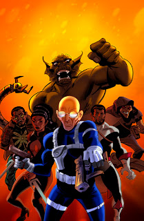
La tonalidad verdosa del fondo me resulta particularmente agradable en combinación con los tonos desaturados de las figuras. El resultado desde el punto de vista cromático está compensado y armonizado. No obstante me da la sensación de que estamos soslayando el tono dramático que debería tener la ilustración. Me decido por cambiar el tono y utilizar una predominante anaranjada. Y este es el resultado.
The greenish tonality of the background turns out to be particularly pleasant in combination with the desaturated tones of the figures. The result is chromatically balanced and harmonized. Nevertheless I have the impression that we are losing the dramatic mood that the illustration should have. I decide to change the tone and to use an orange predominant. And here is the result.
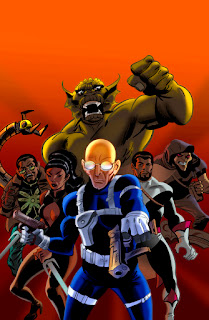
En el siguiente paso vemos ya la ilustración más avanzada. He suavizado el contraste entre áreas de color colindantes y modificado algunas tonalidades. También he acentuado las zonas de luz.
Now we can already see the illustration in a more advanced stage. I have smoothed the contrast between adjoining color areas and modified some tonalities. I have also emphasized the light zones.
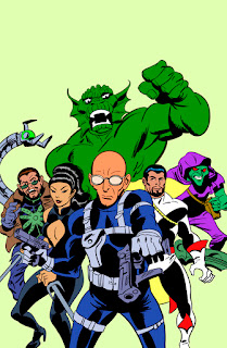
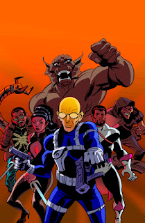
Y este es el resultado final. De nuevo he modificado las tonalidades de color y también he añadido una textura en el fondo a la vez que lo he hecho más luminoso para sugerir que la escena está iluminada desde atrás. Así acentuamos el dramatismo de la ilustración.
And this is the final result. Again I have modified the color tones and I have also a luminous texture in the background in order to suggest that the whole scene is iluminated from behind. This way we stress the dramatic qualities of the illustration.
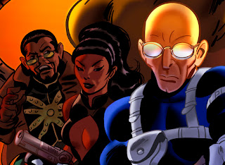
A continuación, un detalle de la ilustración a mayor tamaño:
You may see now a detail of the illustration at a bigger size:


 Para celebrar su décimo aniversario, los chicos de Action Tales me han propuesto hacer una ilustración dedicada al nacimiento de "Los Vigilantes",
una serie ambientada en un mundo donde los villanos Marvel son los
héroes y los héroes Marvel son los villanos.
Para celebrar su décimo aniversario, los chicos de Action Tales me han propuesto hacer una ilustración dedicada al nacimiento de "Los Vigilantes",
una serie ambientada en un mundo donde los villanos Marvel son los
héroes y los héroes Marvel son los villanos.  El siguiente paso es un boceto más detallado y a un tamaño mayor (A4).
 Hago un nuevo boceto con partes que necesitan más definición. Más tarde, en Photoshop pegaré estas zonas en el anterior boceto.
 Todos los elementos anteriores combinados en Photoshop dan como resultado este boceto final que será el que utilizaré para el entintado ya que no necesito un dibujo detallado a lápiz.
 A continuación abrimos la ilustración en Photoshop. Apenas algunos retoques rellenando espacios de negro y añadiendo algunos detalles y damos por terminado el entintado. Ya podemos empezar a colorear.
 En el siguiente paso vamos añadiendo luces y sombras para dar volumen y profundidad a la imagen. También vamos definiendo los valores tonales y la paleta de colores de la ilustración.


